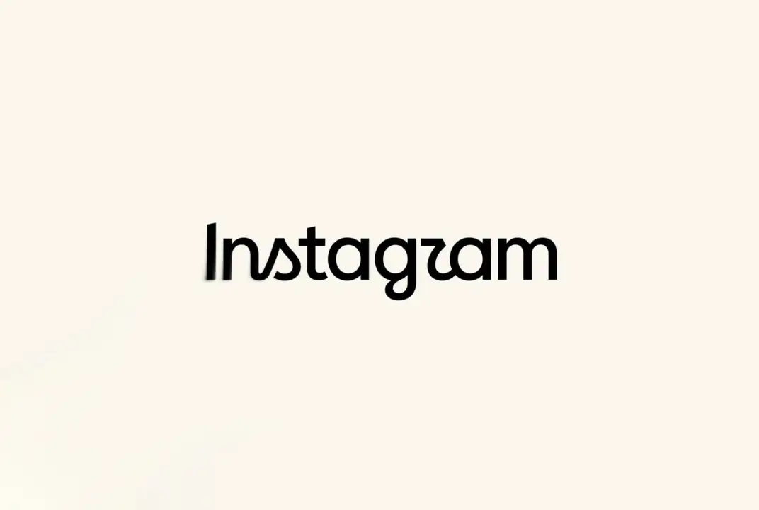

The new “Instagram” wordmark combines handwritten and printed elements. According to company head Adam Mosseri, the design was refreshed to make it more modern while retaining references to the original.
What has changed in Instagram's design?
- Hybrid typeface. The new wordmark combines elements of classic handwritten (cursive) and printed styles.
- Minimalism. The letters are now more condensed and geometrically precise.
- Color palette and icon. The changes affect only the wordmark; the familiar multicolored gradient camera icon remains unchanged.
The update immediately sparked heated discussions on Threads, where Mosseri posted an announcement specifically to gather feedback:
- Readability issues. Many users and industry publications (such as The Verge) noted that the new wordmark is difficult to read.
- A wave of memes. Due to the distinctive shapes of the letters “r” and “a,” many people think the updated logo resembles the word “Instagzam”, which has already become a major source of jokes on social media.
- Nostalgia. Some users expressed deep regret over the disappearance of the iconic flowing script associated with the platform's heyday.
Instagram's previous major brand refresh took place in 2016, when the app finally abandoned the skeuomorphic old retro camera icon.







0 comments
Enter your email — we’ll send you a one-time code. No passwords or accounts.
Code sent to
If the email doesn't appear in your inbox within a few minutes, check your spam, junk, or promotions folder, as some email services may mistakenly place automated messages there